




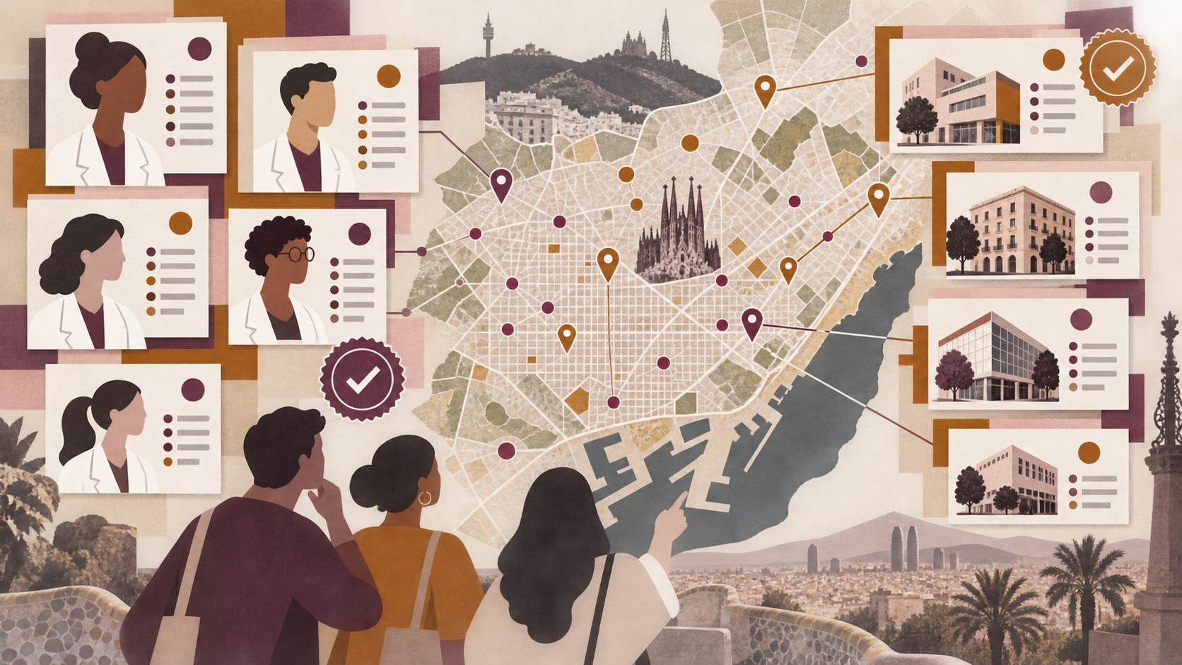
At first glance, a nutrition directory may look like a search project: enter a specialism, choose an area and receive a list. But when we started building Barcelona Nutritionists ↗, we found that the real challenge came before the interface. Before enabling search, we needed to decide exactly what counted as a professional, what counted as a centre, how the two were related, where each data point came from and what we could responsibly claim.
The public project brings together an initial base of 324 professionals and 747 centres or practices, with 440 relationships between entities and 688 mapped locations. These figures are published with an update date and an explicit limitation: this is a broad base built from public records, not an exhaustive official census.
That distinction summarises the project’s philosophy. We did not want a website that merely appeared complete because it displayed a large number. We wanted a tool that explained what it knew, where that knowledge came from and what still needed to be confirmed.
The first important decision was separating professionals and centres
One person may work at more than one centre. One centre may bring together several professionals. A practice can move address or use a commercial name that differs from an individual’s name. If all of this is forced into a single record, duplication and contradiction appear very quickly.
The data model therefore separates three elements:
- Professionals, with their identity and available personal information.
- Centres or practices, with address, contact details, location and service information.
- Relationships, connecting each professional to one or more centres.
This architecture lets us update a location without duplicating the professional, display several places of practice and preserve traceability. It also prevents a common directory error: presenting a practice as though it were a person or attributing centre-level information to an individual.
It is a decision that remains largely invisible to users, but it determines the quality of the entire product.
Different sources do not provide equivalent data
The database was built by combining public sources and information available on websites. CoDiNuCat was one professional reference; the Generalitat’s register of authorised healthcare centres was treated as a separate source for establishments. Other websites and platforms could add context, but they did not replace the original source or turn self-declared information into institutional verification.
The same separation applies to metrics. A Google review is not a Doctoralia review. Social media follower counts do not indicate clinical quality. A website’s languages do not necessarily prove the languages used in consultations. Combining fields because they look similar may simplify the design, but it reduces the quality of the information.
Every data point therefore needs a source, date and status. When it cannot be confirmed, it should remain marked as pending or not found rather than inferred to fill a gap. AI helps compare, normalise and identify potential conflicts, but it does not remove the need for verification.
Turning the data model into an understandable experience
A rigorous database is of little use if the interface forces people to understand the database itself.
The directory offers a more natural entry point: search professionals or centres, explore specialisms, view locations on a map, consult the methodology and reach contact options. Profiles and editorial pages translate the internal structure into real questions: what kind of support am I looking for, where is practical for me, do I prefer an in-person or online appointment, and what can I verify before contacting someone?
The website is available in Spanish and Catalan, with distinct routes, equivalent navigation and adapted content. The main Spanish version and the Catalan version are not two disconnected websites. They share the same data system while providing a coherent language experience for every journey.
The map is particularly important. A healthcare search has an obvious geographical dimension. Locating centres and practices helps turn an abstract list into a practical decision without making proximity the only criterion.
An identity that avoids nutrition clichés
The visual identity uses plum, ochre, white and black, combining functional typography with an editorial voice. We avoided apples, leaves, measuring tapes, scales, idealised bodies and before-and-after imagery.
This is not merely an aesthetic preference. Those codes can reduce nutrition to dieting, weight or personal discipline when the profession includes clinical contexts, public health, habits, medical conditions, sport, collective catering and many other areas.
The website needed to be accessible, professional and approachable without becoming patronising. Hierarchies, contrast, controls, labels and mobile navigation were designed so the directory would work as a consultation tool rather than a body-transformation campaign.
Where AI-generated resource images are used, the website explicitly states that they do not represent the real person. Visual transparency matters as much as data transparency.
Methodology before ranking
“Best nutritionists” pages may respond to genuine search demand, but they can also create false authority when they do not explain their criteria.
In this project, any editorial selection needs to describe its methodology, date, sources and limitations. Visibility cannot be confused with quality of care, and payment cannot be presented as a recommendation. The directory helps people orient themselves and compare available information; it does not guarantee results or replace professional judgement.
The methodology page is not a box-ticking exercise in the footer. It is a central part of the product. It explains the scope of the database, the distinction between sources and the correction process. Professionals and centres need to be able to request updates, add information or report an issue.
How we built the project with AI and human judgement
AI helped accelerate classification, field normalisation, duplicate detection, bilingual content preparation and validation across many routes. It also helped turn an extensive data structure into consistent components and pages.
The decisive work, however, remained human: defining the model, separating sources, reviewing ambiguous cases, limiting claims, deciding what should be indexed, writing the methodology and establishing how data could be corrected.
This pattern matters to Karmina. When we develop a complex website, AI does not replace information architecture or editorial responsibility. It expands them. The work begins with a knowledge foundation and continues with rules that allow it to be applied consistently.
What the project taught us
The nutrition directory confirmed six ideas:
- Good modelling matters more than displaying a large amount.
- Professionals and centres need separate entities.
- Every source must retain its meaning.
- Methodology is part of the user experience.
- Localisation requires routes and content, not only translation.
- AI is especially useful when data, criteria and boundaries are already defined.
Barcelona Nutritionists ↗ is now a public consultation tool and an example of the kind of project we can build for clients: sector directories, specialist search tools, territorial portals and data-based websites that need to grow without losing traceability, identity or judgement.